Color
| Class | Property | SCSS | HEX |
|---|---|---|---|
.bx--checkbox:checked | background-color | $brand-01 | #3d70b2 |
.bx--checkbox-label::before | border | $ui-05 | #5a6872 |
.bx--checkbox-label::before | fill | $ui-01 | #ffffff |
.bx--checkbox-label::after | checkmark | $inverse-01 | #ffffff |
.bx--checkbox-label | color | $text-01 | #152935 |

Disabled and normal checkbox states
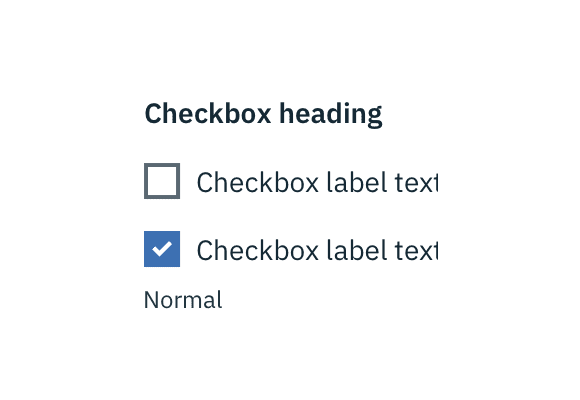
Typography
Checkbox headings and labels should be sentence case, with only the first word in a phrase and any proper nouns capitalized. Checkbox headings and labels should not exceed three words.
| Class | Font-size (px/rem) | Font-weight | Type style |
|---|---|---|---|
.bx--label | 14 / 0.875 | SemiBold / 600 | .bx--type-zeta |
.bx--checkbox-label | 14 / 0.875 | Normal / 400 | - |
Structure
| Class | Property | px / rem | Spacing token |
|---|---|---|---|
.bx--checkbox-label::before | height & width | 18 / 2.75 | - |
.bx--checkbox-label::before | border | 2 / - | - |
.bx--checkbox-label | padding-left | 8 / 0.5 | $spacing-xs |
.bx--form-item.bx--checkbox-wrapper | margin-bottom | 16 / 1 | $spacing-md |
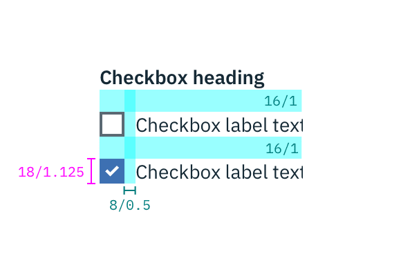
Structure and spacing measurements for checkbox | px / rem