Color
| Class | Property | SCSS | HEX |
|---|---|---|---|
.bx--data-table-v2 tbody | background-color | $ui-01 | #ffffff |
.bx--data-table-v2--zebra tbody tr:nth-child(even) | background-color | $ui-02 | #f4f7fb |
.bx--data-table-v2 thead | background-color | $ui-02 | #f4f7fb |
.bx--data-table-v2 tr:hover td | background-color | $hover-row | #5596e6 at 10% opacity |
tr.bx--expandable-row-v2 > td:first-of-type:before | background-color | $brand-01 | #3d70b2 |
.bx--data-table-v2 th:first-of-type .bx--data-table-v2 th:last-of-type .bx--data-table-v2 th | border-top, border-right, border-left | $ui-04 | #8897a2 |
.bx--data-table-v2 tr:hover td | border | $brand-01 | #3d70b2 |
.bx--responsive-table td .bx--responsive-table th .bx--table-sort-v2 --data-table-v2-header | color | $text-01 | #152935 |
.bx--table-sort-v2__icon .bx--table-expand-v2__svg .bx--overflow-menu__icon | fill | ui-05 | #5a6872 |
Style options
Specific styling on the data table component can be toggled on/off based on user or team preference.
Row dividers, zebra striping, & table border
If zebra striping is turned off, you must have row dividers.
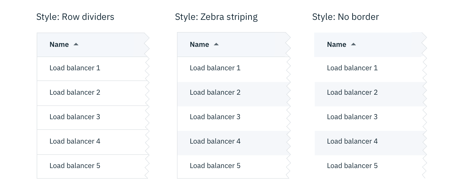
Data table with various row styling
Background colors
Data tables are built to be accessible against two $ui-01 and $ui-02:
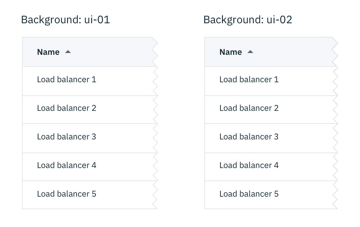
Data table on ui-01 vs ui-02
Typography
Column headers should be in title case. All other table text should be sentenced case.
| Class | Font-size (px/rem) | Font-weight | Type style |
|---|---|---|---|
bx--data-table-v2-header | 18 / 1.125 | Semibold / 600 | .bx--type-delta |
bx--table-header-label | 14 / 0.875 | Semibold / 600 | .bx--type-zeta |
.bx--data-table-v2 td | 14 / 0.875 | Normal / 400 | - |
Structure
Tables are a configurable and customizable component. Designers can pick and choose certain elements and interactions.
Row sizes
Short and Default are offered as user preferences that can be accessed from the table settings menu.
Compact and Tall are designer and developer preferences. Tall row heights are only recommended if your data is expected to have 2 lines of content in a single row.
| Class | Size | Row Height (px/rem) |
|---|---|---|
.bx--data-table-v2--compact | Compact | 24 / 1.5 |
.bx--data-table-v2--short | Short | 32 / 2 |
.bx--data-table-v2 tr | Default | 48 / 3 |
.bx--data-table-v2--tall | Tall | 64 / 4 |
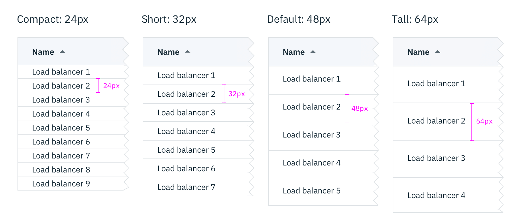 Data table: varying row sizes
Simple data table
The basic table style is the required base from which tables can be developed. Basic tables are composed of a header row followed by rows of data below. At a minimum, tables require three or more columns.
Column widths can vary by content and only requires a minimum spacing between columns.
| Class | Property | px / rem | Spacing token |
|---|---|---|---|
.bx--data-table-v2 tr | height | 48 / 3 | - |
.bx--table-expand-v2__svg | height | 16 / 1 | - |
.bx--checkbox-appearance | height, width | 18 / 1.125 | - |
Data table
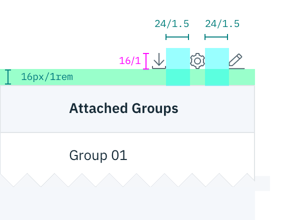
After the simple table structure, tables can be enhanced by adding any of the following: selectable rows, expanding rows, nested tables, row menus, table batch actions, overall table menu, and/or table filter.
| Class | Property | px / rem | Spacing token |
|---|---|---|---|
.bx--data-table-v2-header | margin-bottom | 16 / 1 | $spacing-md |
.bx--table-sort-v2__icon | padding | 2 / 0.125 | $spacing-3xs |
.bx--data-table-v2 td:first-of-type .bx--data-table-v2 td:last-of-type | padding-left, padding-right | 24 / 1.5 | $spacing-lg |

Structure and spacing measurements for a basic and an enhanced data table | px / rem
Recommended
| Spacing between | Property | px/rem | Spacing token |
|---|---|---|---|
| Columns | padding | ≥ 24 / 1.5 | $spacing-lg |
Toolbar
| Class | Property | px/rem | Spacing token |
|---|---|---|---|
.bx--toolbar-action_icon | height | 16 / 1 | $spacing-md |
.bx--toolbar > div | margin-left, margin-right | 4 / 0.25 | $spacing-2xs |
.bx--toolbar | margin-top, margin-bottom | 16 / 1 | $spacing-md |
Structure and spacing measurements for toolbar icons | px / rem