Color
Inputs come in two different colors. The default input color is $field-01 and is used on $ui-01 page backgrounds. The light version input color is $field-02 and is used on $ui-02 page backgrounds.
If a min date is set on the calendar, then any text appearing before that date will be #152935 @ 50%, otherwise all text should be #152935 (unless the number is selected or highlighted). Please refer to select, for inline select styling.
| Class | Property | SCSS | HEX |
|---|---|---|---|
.bx--date-picker__input | background-color | $field-01 | #f4f7fb |
.bx--date-picker__input | border-bottom | $ui-05 | #5a6872 |
.bx--date-picker__input | color | $text-01 | #152935 |
.bx--date-picker__input::placeholder | color | $text-02 | #5a6872 |
.bx--date-picker__input.bx--text-input--light | background-color | $field-02 | #ffffff |
.bx--label | color | $text-01 | #152935 |
.bx--date-picker__calendar | background-color | $ui-01 | #ffffff |
.bx--date-picker__day.selected | color | $text-01 | #152935 |
.bx--date-picker__day.inRange | background-color | $ui-02 | #f4f7fb |
.bx--date-picker__icon | fill | $brand-01 | #3d70b2 |
.bx--date-picker__day.today::after | background-color | $brand-01 | #3d70b2 |
.bx--date-picker__day.selected | border | $brand-01 | #3d70b2 |
.bx--date-picker__day.inRange | background-color | $text-01 | #152935 |
 Date picker example using both $field-02 (top) and $field-01 (bottom)
States
| Class | Property | SCSS | HEX |
|---|---|---|---|
.bx--date-picker__input:focus | border-bottom | $brand-01 | #3d70b2 |
.bx--date-picker__input[data-invalid] | box-shadow | $support-01 | #e0182d |
.bx--form-requirement | color | $support-01 | #e0182d |
.bx--date-picker__input:focus ~ .bx--label | color | $brand-01 | #3d70b2 |
.bx--date-picker__input[data-invalid]:focus + .bx--label | border-bottom | $support-01 | #e0182d |
.bx--date-picker__input[data-invalid]:focus + .bx--label | border-bottom | $support-01 | #e0182d |
Active: Placeholder text should remain when the user clicks into the text input and gets a cursor. Once the user starts typing the hint text is replaced with the user input text.
Error: Error messages appear below the input field and are always present while invalid.
Disabled: Disabled state appears at 50% opacity and has a .not-allowed cursor on hover.
Typography
Labels should be set in sentence case, with only the first word in a phrase and any proper nouns capitalized, and no more than three words.
| Class | Font-size | Font-weight | Type style |
|---|---|---|---|
.bx--label | 14 / 0.875 | Semi-Bold / 600 | .bx--type-zeta |
.bx--time-picker__input-field:placeholder | 14 / 0.875 | Semi-Bold / 600 | .bx--type-zeta |
.bx--time-picker__input-field active | 14 / 0.875 | Semi-Bold / 600 | .bx--type-zeta |
.bx--form-requirement | 12 / 0.75 | Normal / 400 | .bx--type-caption |
Layer
| Class | Layer, Elevation | Box-shadow |
|---|---|---|
.bx--date-picker__calendar | Pop-out, 24 | 0 12px 24px 0 rgba(0, 0, 0, 0.1) |
Structure
Simple and single date pickers
| Class | Property | px / rem | Spacing token |
|---|---|---|---|
.bx--date-picker__input | height | 40 / 2.5 | - |
.bx--date-picker--short .bx--date-picker__input | width | 91 / 5.7 | - |
.bx--date-picker--simple .bx--date-picker__input | width | 114 / 7.125 | - |
.bx--date-picker--single .bx--date-picker__input | width | 144 / 9 | - |
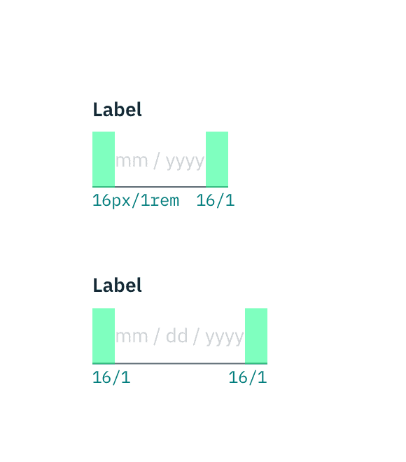
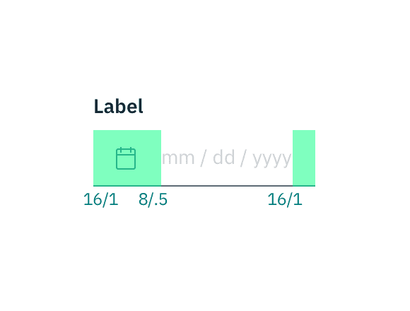
.bx--date-picker__icon | height & width | 16 / 1 | - |
.bx--date-picker__calendar | padding-right, padding-left | 16 / 1 | $spacing-md |
.bx--date-picker__input | box-shadow | 1px | - |
.bx--date-picker__input:focus | box-shadow | 2px | - |
.bx--date-picker__icon + .bx--date-picker__input | padding-left | 48 / 3 | $spacing-3xl |

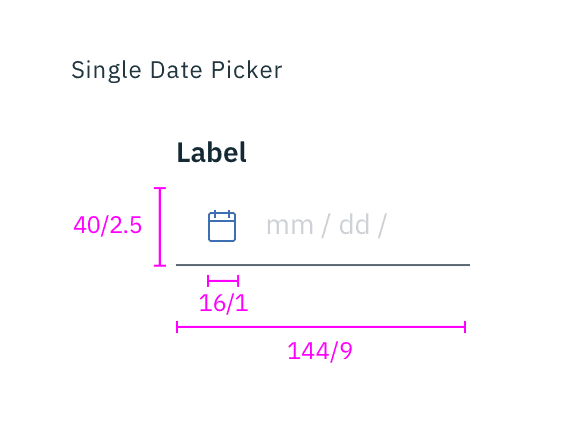
Structure and spacing for simple and single date pickers | px / rem
Range date picker
| Class | Property | px / rem | Spacing token |
|---|---|---|---|
.bx--date-picker__input | height | 230 / 14.375 | - |
.bx--date-picker--range .bx--date-picker__input | width | 280 / 17.5 | - |
.bx--date-picker__icon | height, width | 16 / 1 | - |
.bx--date-picker__day.today::after | height & width | 3px | - |
.bx--date-picker--range > .bx--date-picker-container:first-child | margin-right | 8 / 0.5 | $spacing-xs |
.bx--date-picker__input | padding-right, padding-left, padding-top | 16 / 1 | $spacing-md |
.bx--date-picker__input | padding-bottom | 4 / .25 | $spacing-2xs |
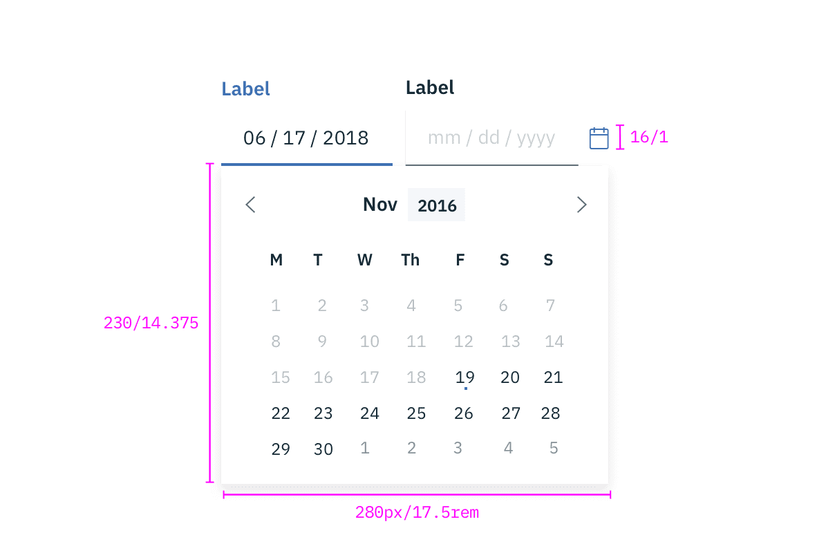 Structure for date picker | px / rem
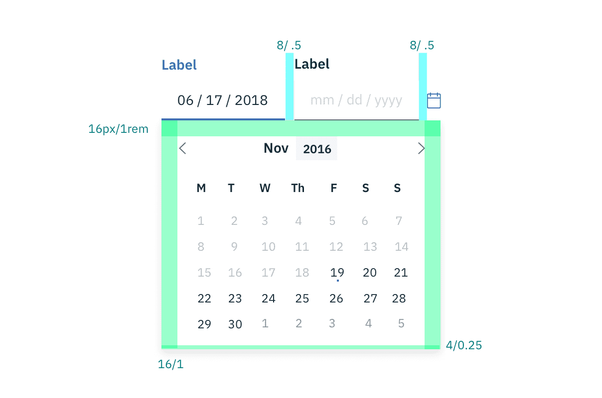 Spacing for date picker | px / rem
Time picker
There are two types of time pickers; a 12-hour and 24-hour time picker. The 12-hour Time Picker is accompanied by a time period (am/pm) input, while the 24-hour clock is not.
| Class | Property | px / rem | Spacing token |
|---|---|---|---|
.bx--time-picker__input-field | height | 40 / 2.5 | - |
.bx--time-picker__input-field | width | 80 / 5 | - |
.bx--time-picker__input-field | padding-right, padding-left | 16 / 1 | $spacing-md |
.bx--select-input | padding-left | 16 / 1 | $spacing-md |
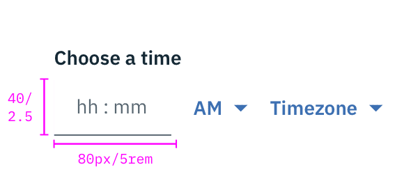
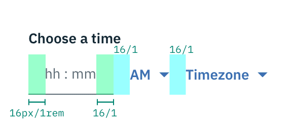
Structure and spacing for a time picker | px / rem