Color
Inputs come in two different colors. The default input color is $field-01 and is used on $ui-01 page backgrounds. The light version input color is $field-02 and is used on $ui-02 page backgrounds.
| Class | Property | SCSS | HEX |
|---|---|---|---|
.bx--number | background-color | $field-01 | #f4f7fb |
.bx--number--light | background-color | $field-02 | #ffffff |
.bx--label | color | $text-01 | #152935 |
.bx--number input[type='number'] | color | $text-01 | #152935 |
.bx--number input[type='number'] | box-shadow | $ui-05 | #5a6872 |
.bx--number__controls svg | fill | $brand-01 | #3d70b2 |
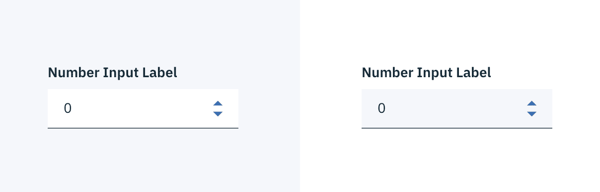 Number Input example in $field-02 (left) and $field-01 (right)
States
| Class | Property | SCSS | HEX |
|---|---|---|---|
.bx--number input[type='number']:focus | box-shadow | $brand-01 | #3d70b2 |
.bx--number input[type='number']:focus ~ .bx--label | color | $brand-01 | #3d70b2 |
.bx--number[data-invalid] input[type='number'] | box-shadow | $support-01 | #e0182d |
.bx--number[data-invalid] input[type='number']:focus ~ .bx--label | color | $support-01 | #e0182d |
.bx--form-requirement | color | $support-01 | #e0182d |
Active: Number input should have a default number to start. The input should never be empty.
Help text: Help text appears below the label when the input is active. Help text remains visible while the input is focused and disappears after focus away.
Error: Error messages appear below the input field and are always present while invalid.
Disabled: Disabled state appears at 50% opacity and has a .not-allowed cursor on hover.
Typography
Number Input labels should use sentence case, with only the first word in a phrase and any proper nouns capitalized.
| Class | Font-size (px/rem) | Font-weight | Type style |
|---|---|---|---|
.bx--label | 14 / 0.875 | Semi-Bold / 600 | .bx--type-zeta |
.bx--number input[type='number'] | 14 / 0.875 | Normal / 400 | - |
.bx--form-requirement | 12 / 0.75 | Normal / 400 | .bx--type-caption |
Structure
The height of a Number Input is always the same. The width however, varies based on content, layout and design. The caret icon can be found in the iconography library.
| Class | Property | px / rem | Spacing token |
|---|---|---|---|
.bx--number input[type='number'] | height | 40 / 2.5 | - |
.bx--number input[type='number'] | padding-left | 16 / 1 | $spacing-md |
.bx--number input[type='number'] | padding-right | 32 / 2 | $spacing-xl |
.bx--number input[type='number'] | box-shadow | 1px | - |
.bx--number input[type='number']:focus | box-shadow | 2px | - |
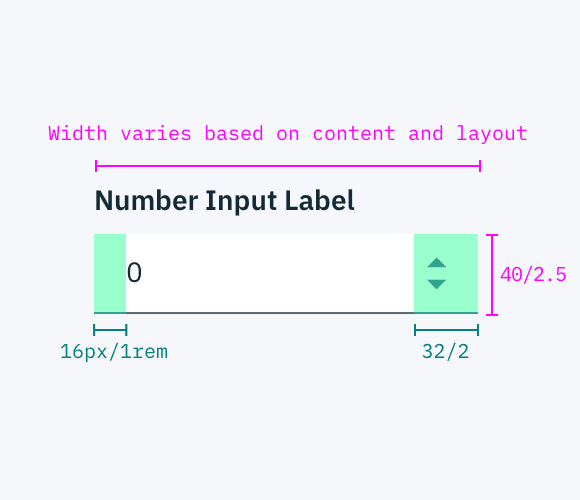
Structure and spacing measurements for a Number Input | px / rem