Color
| Class | Property | SCSS | HEX |
|---|---|---|---|
.bx--radio-button__appearance | border | $ui-05 | #5a6872 |
.bx--radio-button__appearance | background-color | $ui-01 | #ffffff |
.bx--radio-button__appearance:checked | border | $brand-01 | #3d70b2 |
.bx--radio-button__appearance::before | dot | $brand-01 | #3d70b2 |
Typography
Radio Button labels and headings should be set in sentence case, with only the first word in a phrase and any proper nouns capitalized.
| Class | Font-size (px/rem) | Font-weight | Type style |
|---|---|---|---|
.bx--label | 14 / 0.875 | Semi-Bold / 600 | .bx--type-zeta |
.bx--radio-button__label | 14 / 0.875 | Normal / 400 | - |
Structure
| Class | Property | px / rem | Spacing token |
|---|---|---|---|
.bx--radio-button__appearance | height, width | 18 / 1.125 | - |
.bx--radio-button__appearance:checked | height, width | 8 / 0.5 | - |
.bx--radio-button__label | margin-right | 16 / 1 | $spacing-md |
.bx--radio-button__appearance | margin-right | 8 / 0.5 | $spacing-xs |
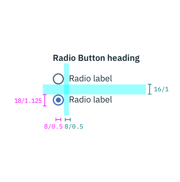
Structure and spacing measurements for Radio Button | px | rem
Recommended
The following specs are not built into the Radio Button component but are recommended by design as the proper amount of space around a grouping of or in between stacked Radio Buttons.
| Class | Property | px / rem | Spacing token |
|---|---|---|---|
.bx--radio-button-group | margin | 16 / 1 | $spacing-md |
.bx--radio-button__label | margin-bottom | 16 / 1 | $spacing-md |
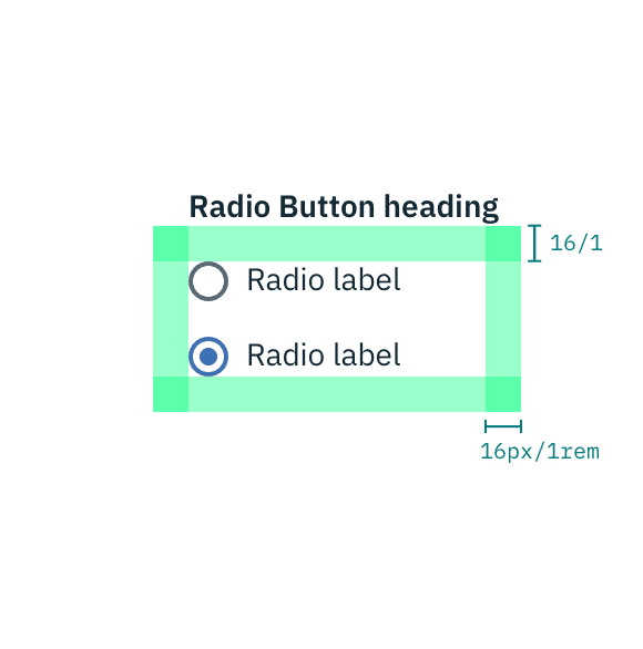
Recommended structure and spacing measurements for Radio Button | px | rem