Color
Inputs come in two different colors. The default input color is $field-01 and is used on $ui-01 page backgrounds. The light version input color is $field-02 and is used on $ui-02 page backgrounds.
| Class | Property | SCSS | HEX |
|---|---|---|---|
.bx--search-input | background-color | $field-01 | #f4f7fb |
.bx--search--light | background-color | $field-02 | #ffffff |
.bx--search-input | text color | $text-01 | #152935 |
.bx--search-input::placeholder | text color | $text-03 | #cdd1d4 |
.bx--search-magnifier | fill | $ui-05 | #5a6872 |
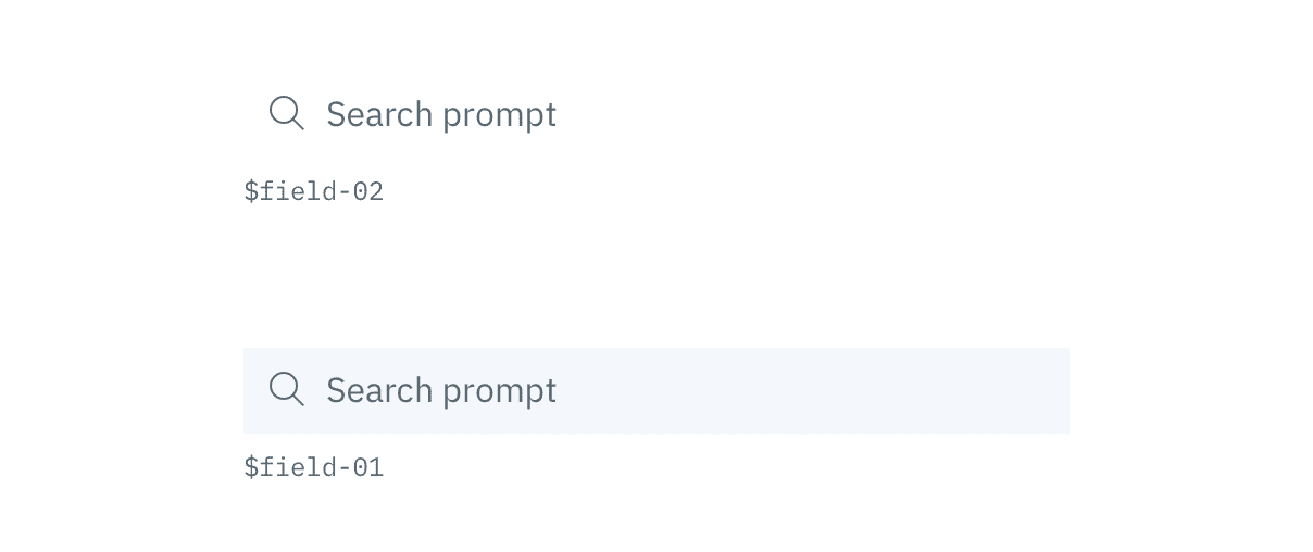 Example of Search using $field-02 (top) and $field-01 (bottom)
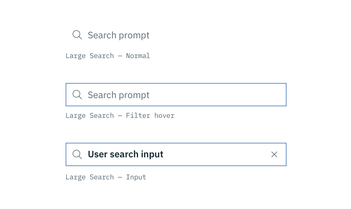 Examples of normal, hover, and input Search states
Typography
Search text should be set in sentence case, with only the first letter of the first word capitalized.
| Property | Font-size | Font-weight | Type style |
|---|---|---|---|
.bx--search-input | 14 / 0.875 | Semi-Bold / 600 | .bx--type-zeta |
.bx--search-input:placeholder | 14 / 0.875 | Normal / 400 | - |
Structure
The width of the Search field should appropriately fit the design and layout of content. Larger Search fields can include a filter button and a list/card view button.
| Class | Property | px / rem | Spacing token |
|---|---|---|---|
.bx--search--lg .bx--search-input | height | 40 / 2.5 | - |
.bx--search--sm .bx--search-input | height | 32 / 2 | - |
.bx--search-magnifier .bx--search-close | height, width | 16 / 1 | - |
.bx--search-input | padding-left, padding-right | 40 / 2.5 | $spacing-2xl |
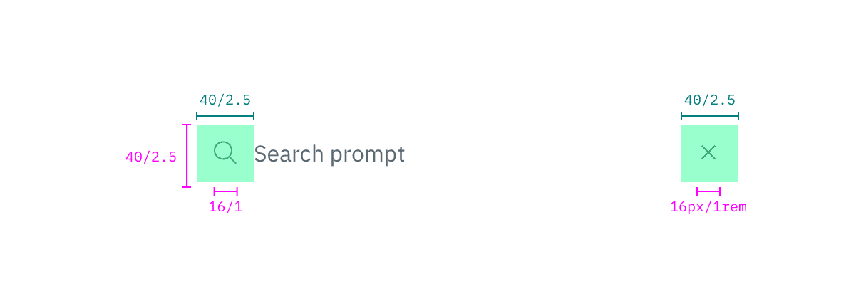 Structure and spacing measurements for Regular Search | px | rem
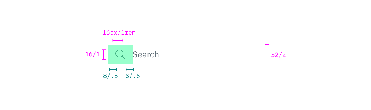 Structure and spacing measurements for Small Search | px | rem