Color
| Class | Property | SCSS | HEX |
|---|---|---|---|
.bx--tooltip__label | text color | $text-01 | #152935 |
svg | fill | $brand-01 | #3d70b2 |
.bx--tooltip--shown | background-color | $ui-01 | #ffffff |
.bx--tooltip | color | $text-01 | #152935 |
.bx--tooltip | border | $ui-03 | #dfe3e6 |
.bx--tooltip__trigger path | fill | $brand-01 | #3d70b2 |
.bx--tooltip--definition__bottom p .bx--tooltip--definition__top p .bx--tooltip--icon__top::after .bx--tooltip--icon__bottom::after | text color | $inverse-01 | #ffffff |
.bx--tooltip--definition__bottom .bx--tooltip--definition__top .bx--tooltip--icon__top::after .bx--tooltip--icon__bottom::after | background-color | $inverse-02 | #272d33 |
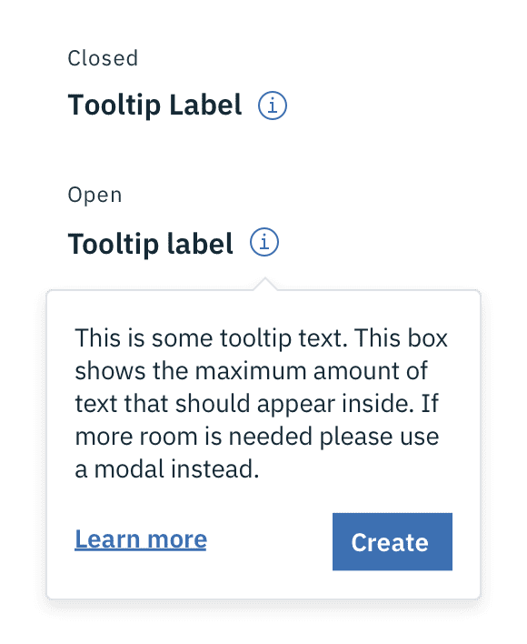
Example of closed and open states for a Tooltip
Typography
Tooltip labels and text should be set in sentence case.
| Property | Font-size (px/rem) | Font-weight | Type styles |
|---|---|---|---|
.bx--tooltip__label | 16 / 1 | Semi-Bold / 600 | .bx--type-epsilon |
.bx--tooltip p | 14 / 0.875 | Normal / 400 | - |
.bx--tooltip--definition__top p .bx--tooltip--icon__top:before | 12 / 0.75 | Normal / 400 | .bx--type-caption |
Layer
| Class | Layer, Elevation | Box-shadow |
|---|---|---|
.bx--tooltip .bx--tooltip--icon__top:before .bx--tooltip--icon__bottom:before .bx--tooltip--definition__bottom .bx--tooltip--definition__top | Overlay, 8 | 0 4px 8px 0 rgba(0,0,0,0.10); |
Structure
All Tooltip types have a varying height based on the amount of content they contain.
Interactive Tooltip
| Class | Property | px / rem | Spacing token |
|---|---|---|---|
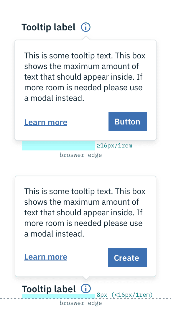
.bx--tooltip | max-width | 240 / 15 | - |
.bx--tooltip__trigger svg | height, width | 16 / 1 | - |
.bx--tooltip__trigger | margin-left | 8 / 0.5 | $spacing-xs |
.bx--tooltip | padding | 16 / 1 | $spacing-md |
.bx--tooltip | margin-top | 8 / 0.5 | $spacing-2xs |
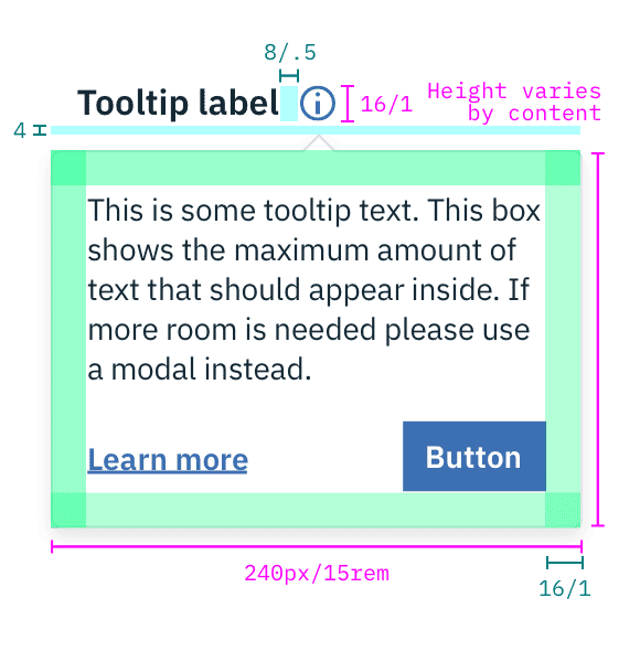
Structure and spacing measurements for an Interactive Tooltip | px / rem
Definition Tooltip
| Class | Property | px / rem | Spacing token |
|---|---|---|---|
.bx--tooltip--definition__bottom .bx--tooltip--definition__top | max-width | 176 / 11 | - |
.bx--tooltip--definition__bottom .bx--tooltip--definition__top | margin-top | 12 / 0.75 | $spacing-sm |
.bx--tooltip--definition__bottom .bx--tooltip--definition__top | padding | 8 / 0.5 | $spacing-xs |
.bx--tooltip--definition .bx--tooltip__trigger | border-bottom | 2px | - |
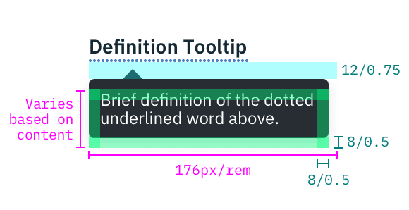
Structure and spacing measurements for a Definition Tooltip | px / rem
Icon Tooltip
| Class | Property | px / rem | Spacing token |
|---|---|---|---|
.bx--tooltip--icon__top:before .bx--tooltip--icon__bottom:before | max-width | 176 / 11 | - |
.bx--tooltip--icon__top:before .bx--tooltip--icon__bottom:before | padding | 4 / 0.25 | $spacing-2xs |
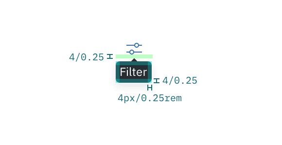
Structure and spacing measurements for an Icon Tooltip | px / rem
Placement
Tooltips should be placed below the Tooltip icon unless it is within the height of the Tooltip box plus 16px / 1rem of the bottom of the page. In that instance, the Tooltip should appear above the icon or defined word. On mobile, Tooltips can only appear below the Tooltip icon.
Placement examples for a Tooltip