Color usage best practices
Color order
For data visualizations with touching colors (no white space between blocks of color representing data), make sure to use the colors in the order they are shown from left to right (dark to light). For example, if you are comparing three sets of data, the colors primary-01, primary-02, and primary-03 are used in that order, respectively.
One variable
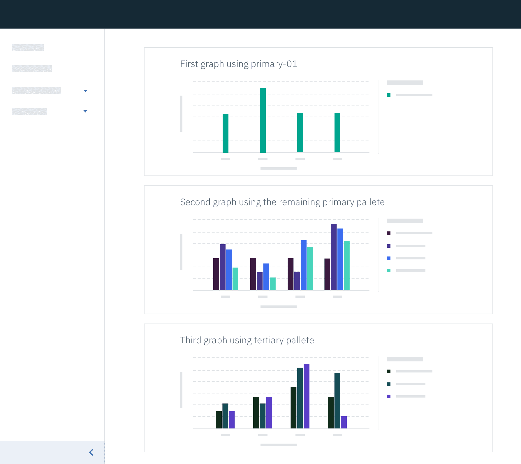
The primary palette is always applied to the first data visualization of any given page. When there is only one data set, use the color primary-04.

primary-04 applied to one data setTwo or more variables
When comparing multiple variables (items listed under a key) in one graph, start by using colors from the primary palette so that each variable has its own assigned color.
 Example of primary theme applied to two+ data sets
Two or more graphs on a page
If there are multiple graphs on a page, the secondary and/or tertiary color palettes may be used. In cases where your first graph only has one data set (using primary-04 as its color) and your second graph requires multiple data sets, choose from the remaining primary palette colors first. Once the primary palette colors have been exhausted, feel free to move on to another palette.
 Example of two themes applied to two data visualizations