General guidelines
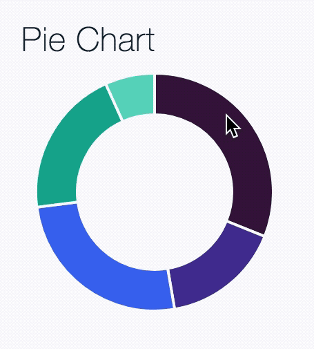
Pie charts show individual values that make up a whole data set so users can compare the values to each other and see how each value compares to the whole. A common way to express the part-to-whole relationship is to use percentages, with the whole equaling 100% and each of its parts equaling smaller percentages corresponding to its value relative to the whole. Expressing exact values is useful as long as the total is also shown.
Example of a Pie Chart