General guidelines
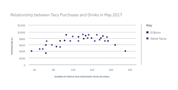
Scatter plots are used to determine whether there is a relationship between two sets of quantitative values by showing the linear correlation between them. Users can identify an individual value on the x-axis and see what happens to that value in relation to the y-axis. Taking the graph as a whole, users can see the strength and direction of the correlation. A strong correlation has a tighter grouping of values, whereas a weak correlation has a looser grouping. A positive correlation shows values trending upward from left to right, which is the opposite for a negative correlation where values trend downward from left to right.
