General Guidelines
There are three different types of Tooltips: Small, Medium, and Large. Tooltips appear above or below a data representation depending on the use case. The quantitative value on the Tooltip corresponds to the numerical value that the data representation is depicting. Choose the type of Tooltip that is the best fit for your data set based on the descriptions below.
Small Tooltip
Use the Small Tooltip when there is one data set. Since only one set of data is being shown, the label and color border are not necessary.
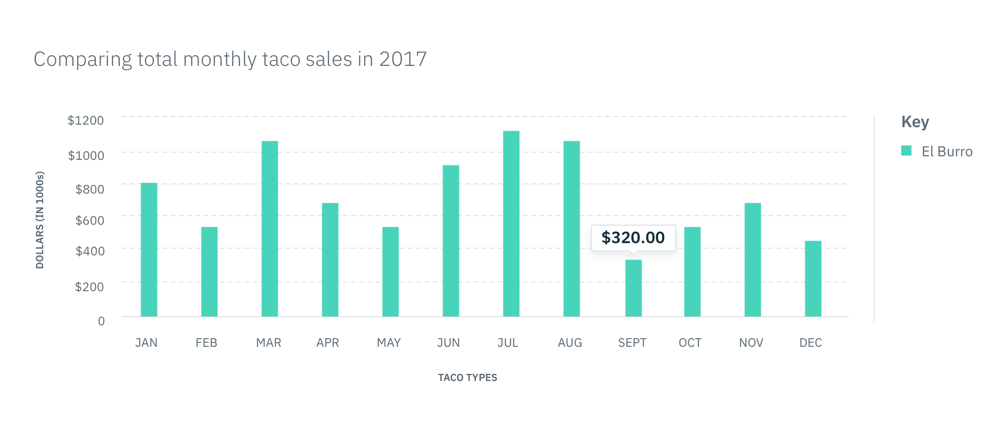 In context example of a Small Tooltip
Medium Tooltip
The Medium Tooltip is used in scenarios where two or more sets of data are being compared. The top border color on the Tooltip should match the color of the data it is representing, as shown in the key. The label can either be referring to the corresponding name in the key or the intersecting data increment on the x-axis. Whichever you choose, make sure the labels are consistent across all Tooltips.
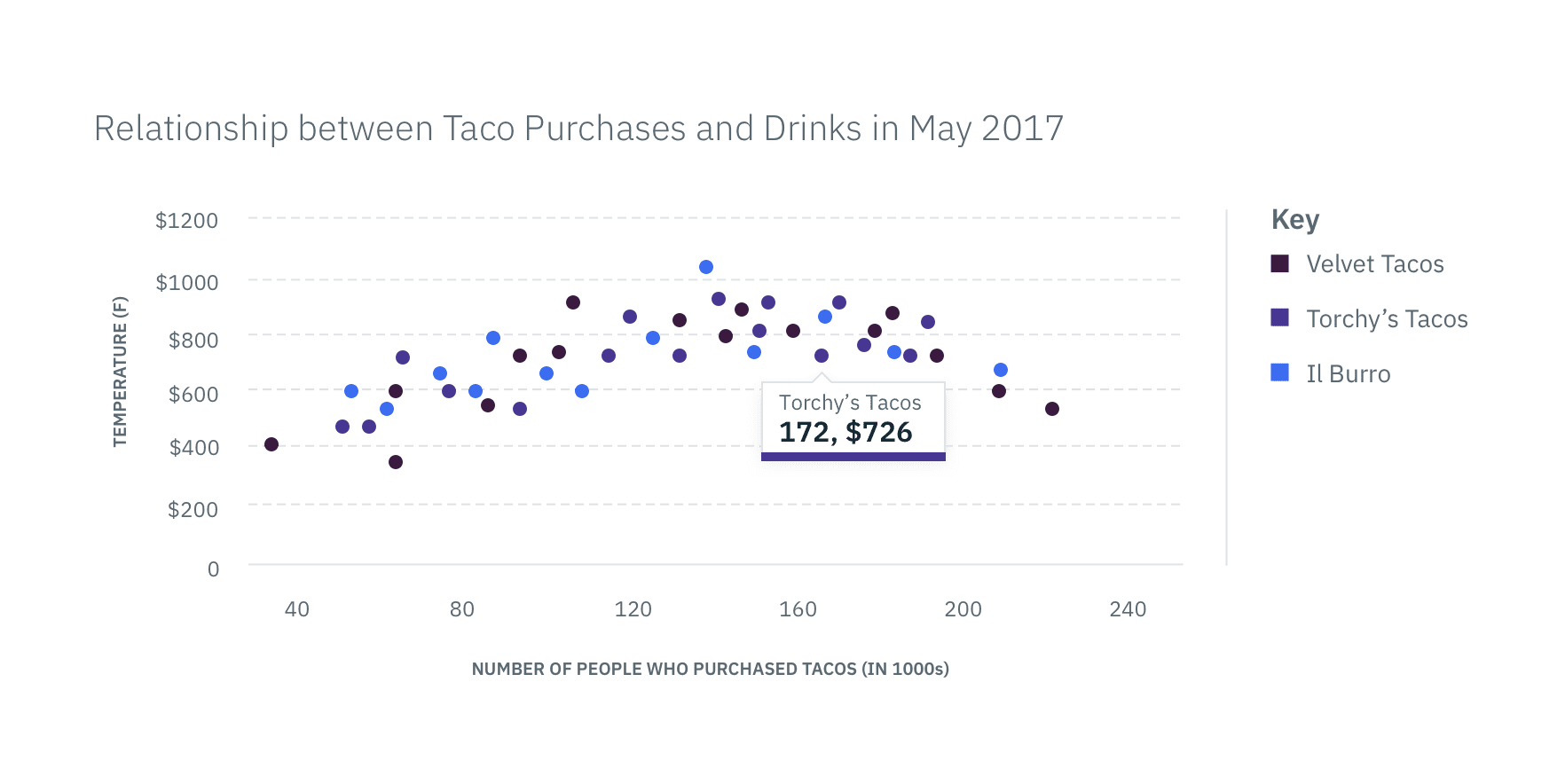 In context example of a Medium Tooltip
Large Tooltip
The Large Tooltip is used when there are multiple data sets represented in a particular data increment. For example, a Line Graph may have several lines passing through one data increment or increment range. All of these data points need to be shown in the Tooltip on hover. The top label describes the data increment being shown while additional labels correspond to the name of the data value in the key. The left side border's color should match the color of the data it is representing, as shown in the key.
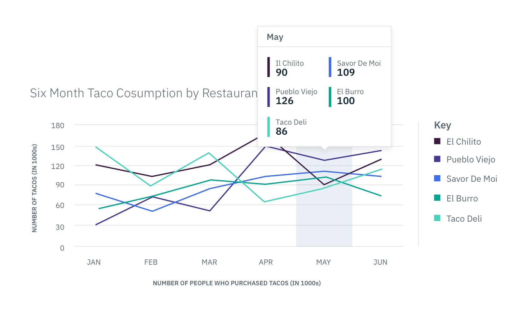 In context example of a Large Tooltip