Checkbox States
The checkbox control allows for three states: selected, unselected, and indeterminate. The indeterminate state comes into play when the checkbox contains a sublist of selections, some of which are selected, and some unselected.
Checkbox vs. Radio Button
Whereas radio buttons represent a group of mutually exclusive choices, users can select one or more checkboxes from a group. In use cases where only one selection of a group is allowed, use the radio button component instead of the checkbox.
Checkbox vs. Toggle Switch
Generally, toggle switches are preferred when the resulting action will be instantaneously applied, without the need for further confirmation. Checkboxes generally represent one input in a larger flow which requires a final confirmation step.
Headings
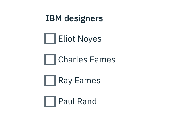
If necessary, a heading can accompany a set of checkboxes to provide further context or clarity. Use sentence case for checkbox headings. In the example below, “IBM designers” would be the heading for the set of checkboxes.
Labels
Always use clear and concise labels for checkboxes. Be explicit about the results that will follow if the checkbox is selected. Labels appear to the right of checkboxes.
Click target
Users should be able to select the checkbox by clicking on the box directly or by clicking on its label.
Tables
See the Data Table section for guidance on how to use checkboxes within a table.
Default selection
The default view of a set of checkboxes is having no option selected.
By default, checkboxes are unchecked.
Related Components
Data Table (coming soon)