General guidelines
| Type | Purpose |
|---|---|
| Text input | When the expected user input is a single line of text, as opposed to a paragraph. |
| Text area | When the expected user input is more than one sentence. |
General guidelines
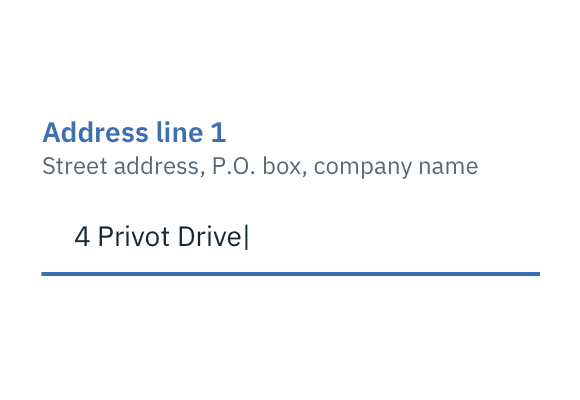
Labels
Effective form labeling helps users understand what information to enter into a text input. Using placeholder text in lieu of a label is sometimes employed as a space-saving method. However, this is not recommended because it hides context and presents accessibility issues.
Accessibility best practices for labels:
- Labels must be visible when an input gets focus.
- Labels must be announced to the screen reader on focus.
- Ensure the helper text that appears under an input is read when an assistive technology user stops at an input using ARIA.
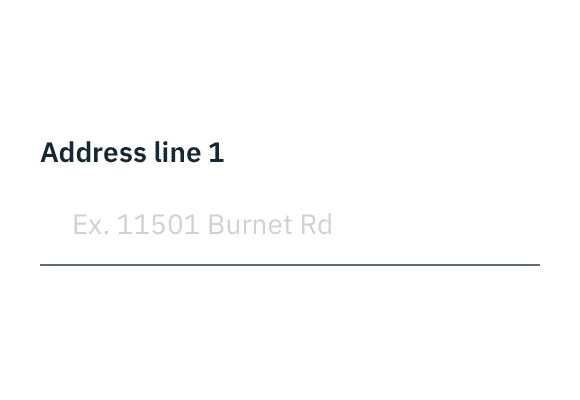
Placeholder text
Placeholder text provides hints or examples of what to enter. Placeholder text disappears after the user begins entering data into the input and should not contain crucial information. Use sentence-style capitalization, and in most cases, write the text as a direct statement without punctuation.
Placeholder text example
Help text
Help text is pertinent information that assists the user in completing a field. Help text is always available when the input is focused and appears underneath the label. Use sentence-style capitalization, and in most cases, write the text as full sentences with punctuation.
Default values
Where possible, add programmatic assistance. Detect and pre-fill inputs to reduce errors and save time. When the software can't determine the value that belongs in an input, use type-ahead to make suggestions. Use sentence-case for default values, detected values, and auto-completion text.
Validation and errors
Real time validation helps to streamline the process and keep data clean when the user is filling out forms. For full guidelines, refer to the forms usage page.

Error example