Resources
Visual usage
Sizing
UI icons are 16px.
While most icons occupy a square artboard, some icons may occupy a rectangular artboard where only the width or height of the icons is 16px. Icons should only be used at their original sizes.
Background
All icons should be on a transparent background and with the artboard boundaries at the edges of the icon. At least one of the edges should be at the standard measurement of 24px or 16px.
Padding
When creating icons, do not add internal padding with Sketch or Illustrator. If the icon needs padding, developers can add this with CSS.
When using icons, all touch targets need to be 44px or higher. With that said, a developer can add padding to a touch target with CSS to meet the 44px requirement.
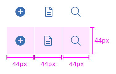
Color
Interactive UI icons need to pass the same color contrast ratio as typography at a 4.5:1 ratio. UI icons are always a solid color. The color of the icon should depend on the importance of the icon's action.
| SCSS | HEX y | |
|---|---|---|
| Primary action | $brand-01 | #3d70b2 |
| Primary action:hover | $hover-primary | #30588C |
| Secondary action | $ui-05 | #5a6872 |
| Secondary action:hover | $hover-secondary | #3d70b2 |
Exception: There is an exception to both the brand-01 and UI color rules. Certain icons, such as status or notification icons, can inherit their parent color. For example, a warning icon is yellow because warning notifications are yellow.
Weight
Icons of the same size should have the same visual weight. One icon should not look heavier or lighter than another icon of the same size. Most UI Icons are drawn with a two pixel stroke.
Make sure the 2px stroke does not change when resizing icons because it causes icons to look uneven. When scaling icons you should always start each icon at the same base size (preferably the default of 24px).
Glyphs or 16 pixel icons, should always be a filled icon. This adds visual weight to the icon, allowing it to maintain its proper emphasis and stay legible. Fine stroke weights can disappear or break at the glyph size.
Pixel grid
When drawing or re-sizing icons make sure the vector always aligns to the base pixel grid. This ensures pixel clarity and crispness on all screen ratios. The x and y coordinates of icons should never contain decimals.
Developer usage
Using SVG sprite (recommended)
Requirements:
- Install
carbon-icons
Using SVG sprite from static assets (recommended)
Use the SVG sprite (carbon-icons.svg) by serving it as a static asset.
Then reference the SVG icon you want to display using a path to the SVG sprite file.
To use SVG sprite files, they must be distributed through a web server and while using svgxuse.
<!-- From static assets  -->
<svg>
  <use xlink:href="/path_to_static-assets/carbon-icons.svg#icon_name"></use>
</svg>
path_to_static-assets is the path to your static assets where carbon-icons.svg is located.
icon_name is the icon name, which will display the corresponding icon. Refer to the iconography library page for a full list of icon names.CSS
You can override size and color with CSS.
<svg class="icon">
  <use xlink:href="/path_to_static-assets/carbon-icons.svg#icon_name"></use>
</svg>
.icon {
  width: 24px;
  height: 24px;
  fill: red;
}
All icons in the library are standardized so that they do not include stroke or internal spacing (padding).
Inline SVG
If you're unable to use the recommended SVG sprite or svgxuse, you can inline SVG directly into your HTML.
Visit carbon-icons and browse the svg folder for any icons you want to use. (Remember, svg subfolders contain deprecated icons. Don't use these).
Main files
Carbon icons ship with two main SVG files that contain different sets of external SVG sprite files:
| Filename | Description | Supported versions |
|---|---|---|
| carbon-icons.svg | Contains current icons (consolidated subset of legacy icons used in IBM Bluemix) | 3.x and newer |
| carbon-icons.json | JSON file created from carbon-icons.svg, used in Carbon | 3.x and newer |
| carbon-icons.js | JS module created from carbon-icons.svg, used in Icon React Component in carbon-components-react | 3.x and newer |
| sprite.svg | SVG sprite contains legacy icons | 1.x, 2.x and 3.x |
| icons.json | legacy JSON file created from sprite.svg | 1.x, 2.x and 3.x |
| legacy-icons.js | JS module created from sprite.svg | 3.x only |
Accessibility
For screen reader accessibility, provide a context-rich title for the SVG using <title> element.
<svg>
  <title>Add a new service</title>
  <use xlink:href="/carbon-icons/dist/icon--add--glyph"></use>
</svg>
If support for older browsers is needed, use aria-labelledby attribute to reference the <title> element using an id.
The <title> element will be read by the screen reader to the user so it should describe its purpose.
Make sure that you do not duplicate this id.
<svg aria-labelledby="add">
  <title id="add">Add a new service</title>
  <use xlink:href="/carbon-icons/dist/icon--add"></use>
</svg>
For more details on accessibility, see the following resources:
- "Accessible SVGs" via CSS-Tricks
- "5.4 The 'desc' and 'title' elements" via W3C.org