GitHub repos
Carbon Design Kit
A Sketch file containing core visual styles, components, and patterns a designer needs to use Carbon as a framework for building product experiences.
Carbon components
Provides developers with a collection of re-usable HTML and Sass partials they can use for building websites and user interfaces.
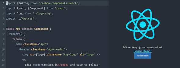
Carbon components (React)
Provides developers with a collection of re-usable React components they can use for bulding websites and user interfaces.
Carbon Components (Angular)
Provides developers with a collection of re-usable Angular components they can use for bulding websites and user interfaces.
Tools
Carbon CodePen
CodePen, a social development playground for front-end developers and designers, houses demos of Carbon Components.
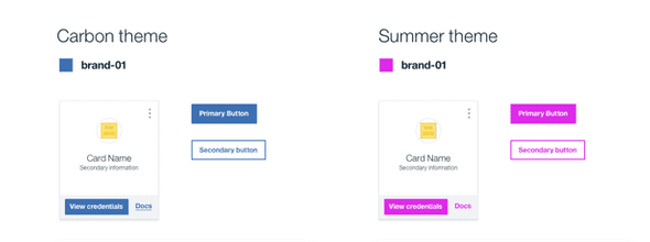
Themeing sandbox
The sandbox allows you to build a custom theme by changing a color variable’s hex value and then exporting the theme sheet SCSS file.
Color contrast checker
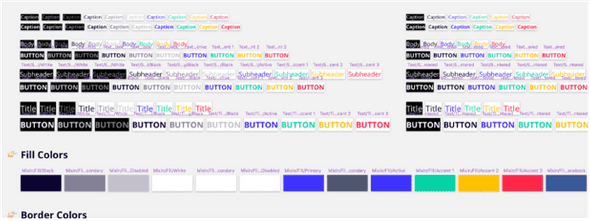
This color contrast checker allows you to easily calculate the color contrast ratio between two colors, ensuring that it passes WCAG 2.0 Level AA requirements.
Carbon boilerplate
A simple boilerplate for rapid UI prototyping with Carbon components.
Carbon React storybook
Carbon components, in React.
Additional resources
IBM Plex
IBM uses the font Plex across products for brand consistency and cohesion.
IBM Design Language
Carbon uses the IBM Design Language as our guiding principle. These core values remind us to design for an outcome and to be authentically thoughtful.
Featured

Smashing Magazine's “Design Systems” Book

Winter 2017 HOW In-House Design Award Winner
Path to Design System Maturity
Responsive Web Design Podcast