Color
| Class | Property | SCSS | HEX |
|---|---|---|---|
.bx--content-switcher-btn | border | $brand-01 | #3d70b2 |
.bx--content-switcher-btn | color | $brand-01 | #3d70b2 |
.bx--content-switcher-btn.bx--content-switcher--selected | background-color | $brand-01 | #3d70b2 |
.bx--content-switcher-btn.bx--content-switcher--selected | color | $inverse-01 | #ffffff |
.bx--content-switcher-btn.bx--content-switcher--selected:hover | background & border color | $hover-primary | #30588c |
States
Content switchers have two states: selected and non-selected. Selected states are a solid color. There must always be only one selected state, no more, no less. Unselected options have a 1px border with no fill.
Typography
Content switcher text should be set in sentence case, with only the first word in a phrase and any proper nouns capitalized. The text should not exceed three words.
| Class | Font-size (px/rem) | Font-weight | Type style |
|---|---|---|---|
.bx--content-switcher-btn | 14 / 0.875 | Normal / 400 | - |
Structure
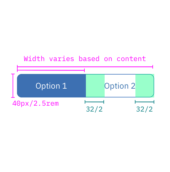
Content switchers must have at least two options for the user to choose from. Each container that makes up the content switcher is equal in size. The width of a container is determined by the length of the longest container option text plus the 32 px / 2rem on both sides of the text.
| Class | Property | px / rem | Spacing token |
|---|---|---|---|
.bx--content-switcher | height | 40 / 2.5 | - |
.bx--content-switcher-btn:not(:first-of-type) .bx--content-switcher-btn | border, border-left, border-right | 1px | - |
.bx--content-switcher-btn | padding-left, padding-right | 32 / 2 | $spacing-xl |