Color
| Class | Property | SCSS | HEX |
|---|---|---|---|
.bx--modal-container | background-color | $ui-01 | #ffffff |
.bx--modal-container | border-top | $brand-01 | #3d70b2 |
.bx--modal-header__label | color | $text-01 | #152935 |
.bx--modal-header__heading | color | $text-02 | #5a6872 |
.bx--modal-content | color | $text-01 | #152935 |
.bx--modal-close__icon | fill | $ui-05 | #5a6872 |
.bx--modal-footer | background-color | $ui-05 | #5a6872 |
.bx--modal | background-color | $ui-03 | #dfe3e6 @ 50% opacity |
Typography
Modal labels are optional and should be set in all caps when used. Modal titles should be set in sentence case and should not exceed three words. Important directions or information in the Modal text can be bold, otherwise it should be in roman.
| Class | Font-size (px/rem) | Font-weight | Type style |
|---|---|---|---|
.bx--modal-header__label | 14 / 0.875 | Semi-Bold / 600 | .bx--type-zeta |
.bx--modal-header__heading | 28 / 1.75 | Light / 300 | .bx--type-beta |
.bx--modal-content | 16 / 1 | Normal / 400 | p |
Layer
| Class | Layer, Elevation | Box-shadow |
|---|---|---|
.bx--modal-container | Pop-out , 24 | 0 12px 24px 0 rgba(0,0,0,0.10); |
Structure
| Class | Property | px / rem | Spacing token |
|---|---|---|---|
.bx--modal-container | border-top | 4 / 0.25 | - |
.bx--modal-close__icon | height, width | 10 / 0.625 | - |
.bx--modal-container | padding-left, padding-right | 48 / 3 | $spacing-3xl |
.bx--modal-container | padding-top | 40 / 2.5 | $spacing-2xl |
.bx--modal-header__label .bx--type-delta | margin-bottom | 8 / 0.5 | $spacing-xs |
.bx--modal-header | margin-bottom | 24 / 1.5 | $spacing-lg |
.bx--modal-content | margin-bottom | 48 / 3 | $spacing-3xl |
.bx--modal-footer | padding-top, padding-bottom | 32 / 2 | $spacing-xl |
.bx--modal-footer | padding-left, padding-right | 48 / 3 | $spacing-3xl |
.bx--btn--secondary + .bx--btn--primary, | margin-left | 16 / 1 | $spacing-md |
 Structure and spacing measurements for a Passive Modal | px / rem
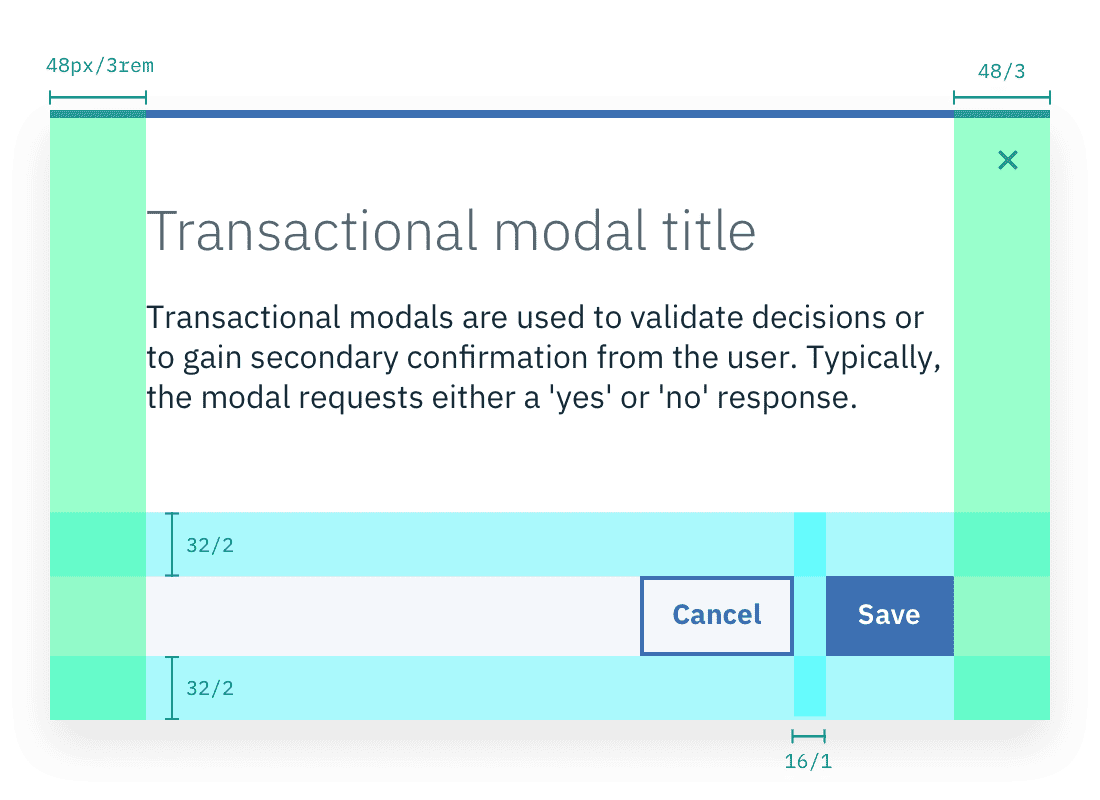 Structure and spacing measurements for a Transactional Modal | px / rem
Mobile
Modals should be full screen on mobile.
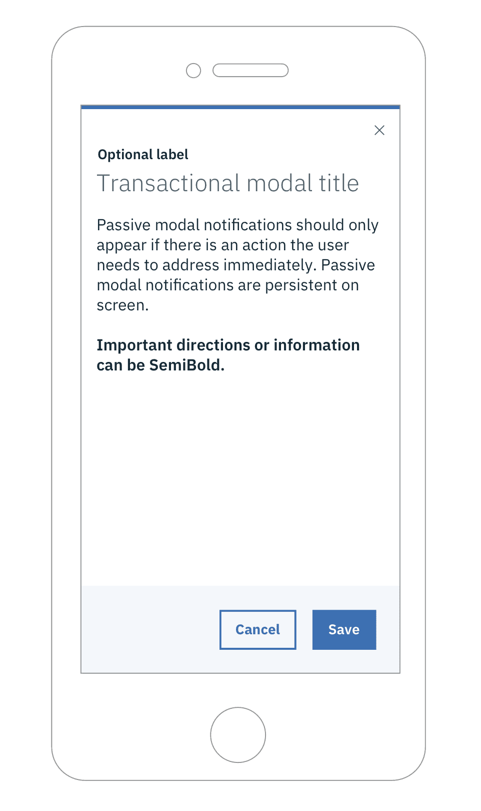
Example of a Modal on a mobile screen